Visualizing Emerging Risks of Heat Extremes and Premature Death Rate in Southeast Asia under Climate Change#
Project Overview
Design creative visualizations to unravel the risks of heat extremes and the associated premature mortality rate in Southeast Asia using the latest climate model simulations.
Submission Guide
Deadline: Tuesday 11:59 pm, 5th December 2023 (Note: Late submissions will not be accepted).
You must submit your project to Canvas. Please upload a Jupyter Notebook with the name “FinalProject_StudentID.ipynb”. You need to include your codes, figures, and the required write-ups in a single Jupyter Notebook file. Make sure to write down your student ID and full name in the cell below.
For any questions, feel free to contact Prof. Xiaogang HE (hexg@nus.edu.sg) and Zhixiao NIU (niu.zhixiao@u.nus.edu).
### Fill your student ID and full name below.

# Student ID:
# Full name:
Data Description#
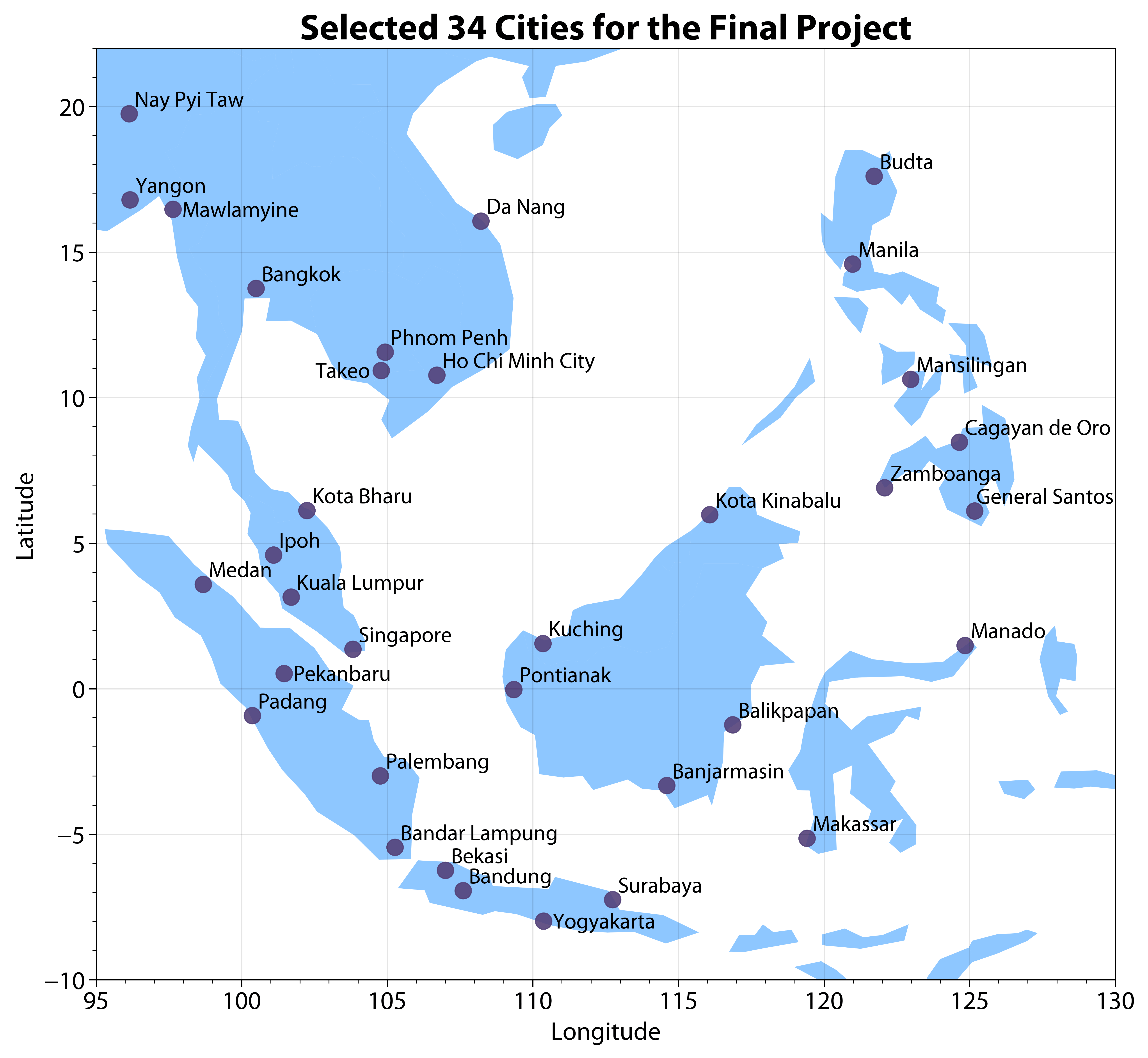
Each of you has been randomly assigned a city in Southeast Asia (see Figure below) according to your student ID. For this project, you only need to work on the city that we assigned to you. Simulated near-surface air temperature (tas, unit: K) from the latest climate models have been provided (available here, you can load the data directly without downloading using the example provided below). This data have been divided into two parts: historical (1850.01.01-2014.12.31) simulations (CityName_hist.csv) and future (2015.01.01-2099.12.31) projections (CityName_future.csv). Historical data contains 12 climate models and 60265 time steps. Future data contains 12 climate models and 31046 time steps in 2 climate scenarios (ssp245: sustainable development scenario; ssp585: fossil-fuel based development; check SSP details here).
# Run the following script to obtain the city assigned to you.
# Note: You must use the assigned city for this project.

def getCityName(studentID):

    import json
    studentCity = json.load(open('../../assets/data/2023_FinalProject_Student_City.json'))

    if studentID not in studentCity.keys():
        raise ValueError('%s is not a correct student ID!'%studentID)
    else:
        return studentCity[studentID]

# Example: (please use your own ID)
studentID = 'A0000000B'
cityName = getCityName(studentID)

print(cityName)
Singapore
An example is provided on how to load the temperature data for historical (tas_hist) and future (tas_ssp245, tas_ssp585) simulations from the provided .csv files. For more details on data loading and preprocessing, please check the Pandas tutorial.
# Run the following script to obtain the data assigned to you.
cityName = "Singapore"

def load_data(cityName):

    import pandas as pd
    url = "https://raw.githubusercontent.com/XiaogangHe/python-climate-visuals/master/assets/data/finalproject"
    hist_address = url + "/" + cityName + "_hist.csv"
    future_address = url + "/" + cityName + "_future.csv"

    # Refer to https://pandas.pydata.org/pandas-docs/stable/user_guide/advanced.html
    # for more details about MultiIndex of DataFrame
    hist = pd.read_csv(hist_address, header=[0,1],
                       index_col=0, parse_dates=True)
    idx = pd.IndexSlice
    # huss_hist = hist.loc[:,idx["huss",:]].droplevel(level=0,axis=1)
    tas_hist = hist.loc[:,idx["tas",:]].droplevel(level=0,axis=1)

    future = pd.read_csv(future_address, header=[0,1,2], index_col=0, parse_dates=True)

    # huss_ssp245 = future.loc[:,idx["huss","ssp245",:]].droplevel(level=[0,1],axis=1)
    # huss_ssp585 = future.loc[:,idx["huss","ssp585",:]].droplevel(level=[0,1],axis=1)
    tas_ssp245 = future.loc[:,idx["tas","ssp245",:]].droplevel(level=[0,1],axis=1)
    tas_ssp585 = future.loc[:,idx["tas","ssp585",:]].droplevel(level=[0,1],axis=1)

    return tas_hist, tas_ssp245, tas_ssp585

tas_hist, tas_ssp245, tas_ssp585 = load_data(cityName)
Task 1 (20 marks)#
Create “warming” stripes to visualize historical (1950-2014) and future (2015-2099) warming trends. You can use the annual average temperature from 1850 to 1900 as the baseline to calculate annual temperature anomalies for the required periods (1950-2014 and 2015-2099).
# Your solutions go here.
# Use the + icon in the toolbar to add a cell.
Task 2 (40 marks)#
Visualize the changing risks of heat extremes from historical (1950-2014) to future (2015-2099) periods. To do this, you need to:
Fit Generalized Extreme Value (GEV) distributions to the annual maximum daily temperature over different periods (e.g., 1850-1900 for pre-industrial baseline, 1950-2014 for the historical period, and 2015-2099 for future scenarios) and across different emission scenarios (ssp245 and ssp585), respectively. How do the shapes of GEV distributions change?
Visualize the shift in your fitted GEV distributions over different periods and across different emission scenarios. (Hint: You may use visualization tools such as Ridgeline plot)
Calculate the return period for heat extremes in historical and future scenarios based on the fitted GEV distribution using pre-industrial data. Compare with the return period obtained from fitted GEV distributions using historical and future simulations. What do you observe?
# Your solutions go here.
# Use the + icon in the toolbar to add a cell.
Task 3 (20 marks)#
Extreme heat increases the risk of a number of adverse health outcomes, worsening chronic health conditions such as heart and lung disease. Moreover, exposure to hot temperatures is associated with premature deaths. Based on the GEV distribution that you fit to the future temperature simulation, compare heat-induced excess mortality in different levels of heat extremes. To do this, you need to:
Calculate the excess mortality rate for the 45- to 64-year-old population (see the Appendix) for the 1-in-100-year heat extreme under the ssp245 scenario.
Repeat the above calculation for the 1-in-1000-year and 1-in-10000-year event and visualize the difference against the 1-in-100-year event.
Repeat the calculation for the ssp585 scenario for all three event (i.e., 1-in-100-year, 1-in-1000-year, 1-in-10000-year) and visualize the difference against the ssp245 scenario.
# Your solutions go here.
# Use the + icon in the toolbar to add a cell.
Short Write-ups (20 marks)#
What story are you trying to tell? (Hints: You could discuss major findings from your analysis, key takeaways, and possible implications.)
Why did you choose such a design and how does it facilitate effective communication? (Hint: you could provide some rationale in terms of your choice of chart types, use of color, size, etc.)
# Your write-ups go here.
# Use the + icon in the toolbar to add a cell.
Tips#
For all three tasks, design your visualizations to incorporate uncertainties from (1) climate models (which exist over the entire period from 1950-2099) and (2) climate scenarios (which only exist during 2015-2099).
While you can create 24 (12 climate models × 2 climate scenarios) similar warming stripes for Task 1, I hope you could come up with some creative design (e.g., layout, chart types) to visualize all information with a minimum number of graphs.
You can recycle your codes from HW1 and HW2.
Official IPCC visual style guide can be found here.
Feel free to make your own design. You can also utilize animation for storytelling.
Appendix#
Exposure to heat extremes is associated with premature death. Assume the empirical relationship between temperature and excess mortality rate for the 45- to 64-year-old population can be estimated by:
where \(\text{Mortality}\) is the excess mortality (per 100k) for the 45- to 64-year-old population and \(T\) is the temperature (°C).