
1.1. Matplotlib tutorial (Basic)#
Matplotlib is a powerful and comprehensive library for creating static, animated, and interactive visualizations in Python.
This tutorial covers some basic usage patterns and practices to help you get started with Matplotlib:
Get to know Matplotlib: architecture and plotting methods
Workflow example: create a plot step by step
Plots in statistics: histograms, density plots, pie charts, bar charts, box plots, and scatter plots
Time series data visualization: line plots, histograms and density plots, box plots, lag plots, and autocorrelation plots
2D plotting methods: images, contour plots, quiver plots, and stream plots
1.1.1. Installation#
You can install Matplotlib either using pip or conda. Open the console and run pip install matplotlib for pip, or conda install matplotlib for conda.
To verify that Matplotlib is successfully installed on your system, import Matplotlib and print its version.
import matplotlib as mpl

print(mpl.__version__)
3.5.1
1.1.2. Matplotlib architecture#
Before diving into using Matplotlib, it is necessary to figure out the Matplotlib architecture, which can help you avoid some confusions and save your time in learning Matplotlib. There is an article explaining Matplotlib architecture in detailed:
Hunter, J., & Droettboom, M. (2012). matplotlib in A. Brown (Ed.), The Architecture of Open Source Applications, Volume II: Structure, Scale, and a Few More Fearless Hacks (Vol. 2).
There are three main layers in Matplotlib architecture:
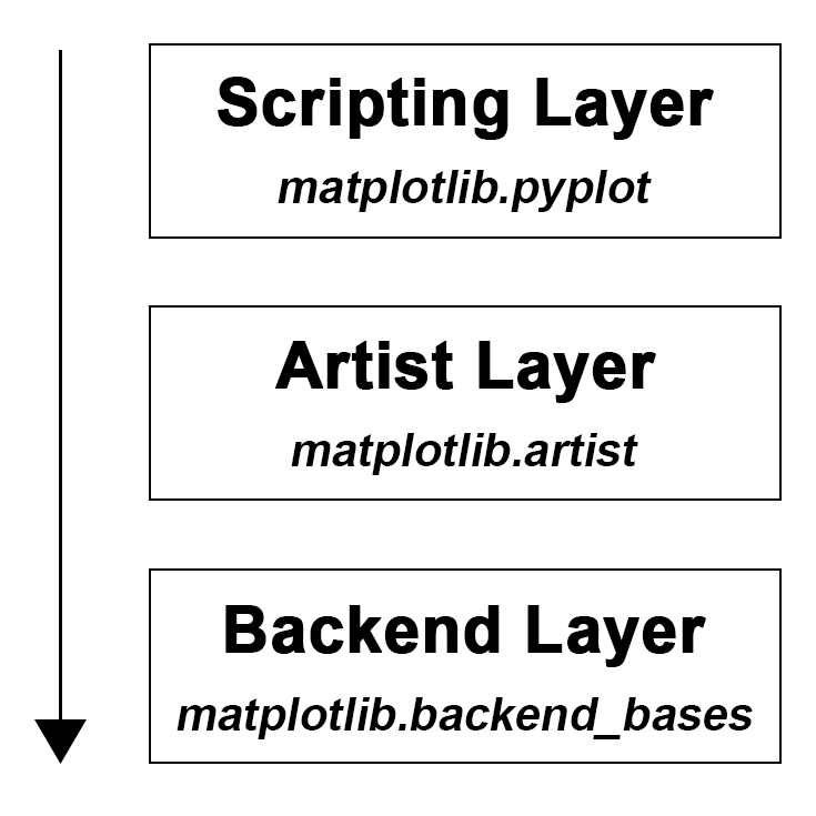
1.1.2.1. Backend Layer#
A backend is an abstraction layer which knows how to handle all the heavy works via communicating to the drawing toolkits in your machine, and target different outputs. In the Jupyter Notebook, the IPython magics are the helper functions which set up the environment so that the web based rendering can be enabled. You can show matplotlib figures directly in the notebook by using the %matplotlib notebook or %matplotlib inline magic commands. Jupyter notebook uses inline backend by default. But %matplotlib notebook can provide an interactive environment using nbAgg backend.
# %matplotlib notebook
mpl.get_backend()
'module://matplotlib_inline.backend_inline'
1.1.2.2. Artist Layer#
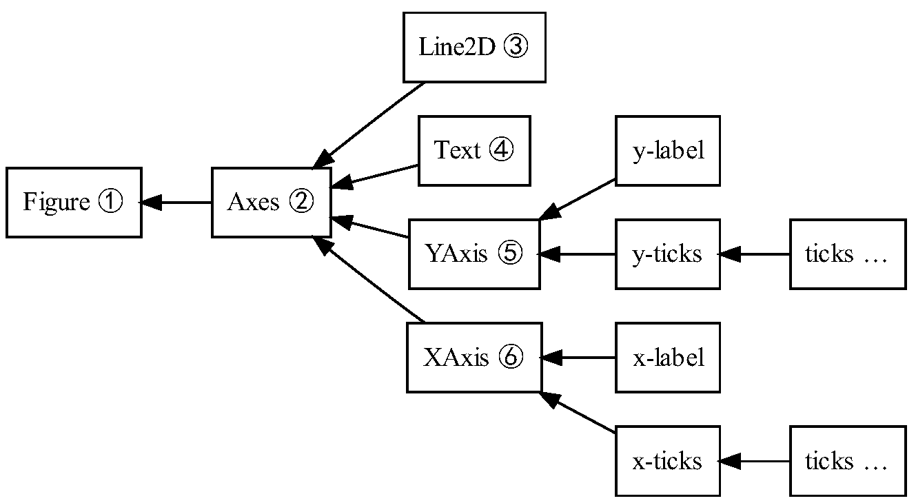
The artist layer is what we will spend most of our time working with. There are two types of artists: primitives and containers. The primitives represent the standard graphical objects we want to paint onto our canvas: Line2D, Rectangle, Text, AxesImage, etc., and the containers are places to put them (Axis, Axes and Figure). The standard use is to create a Figure instance, use the Figure to create one or more Axes or Subplot instances, and use the Axes instance helper methods to create the primitives.
 |
 |
1.1.2.3. Scripting Layer#
The scripting layer comprises a collection of command style functions for a quick and easy generation of graphics and plots. The scripting layer we use in this tutorial is called pyplot. It is the easiest part to start with and use, and you can create a figure, create a plotting area in the figure, and add up objects (e.g. line, text, rectangle) on top of the figure, etc.
import matplotlib.pyplot as plt
Tip
You can conveniently access a quick start guide for a function by adding ? at the end or using help().
# help(plt.plot)
plt.plot?
1.1.3. Two methods of plotting#
In this section, two basic methods of plotting will be illustrated by simple examples.
1.1.3.1. Plot with scripting layer: plt.xxx( )#
In this case, we can simply call one function on a module named plot. Then the pyplot scripting interface will manage a lot of objects for us. It keeps tracking the latest figure of subplots, and the axis objects. Moreover, it actually hides some of these behind methods of its own. The pyplot module itself has a function which is called plot, but it redirects calls of this function to the current axes object.
# because the default is the line style '-',
# nothing will be shown if we only pass in one point (4,5)
plt.figure() # create a new figure
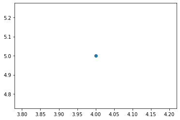
plt.plot(4, 5)
[<matplotlib.lines.Line2D at 0x13f0d7d90>]
# we can pass in 'o' to plt.plot to indicate that we want
# the point (4,5) to be indicated with a marker 'o'
plt.plot(4, 5, 'o')
[<matplotlib.lines.Line2D at 0x13f13bd60>]
1.1.3.2. Plot with artist layer: ax.xxx( )#
In this case, we can do more customisation by onbtaining axes object and operating on it directly. It is more convenient for advanced plots. Especially when handling multiple figures/axes, you will not get confused as to which one is currently active since every subplot is assign to an axes.
We can obtain axes and figure objects with the help of pyplot module, or it will be onerous. Two basic ways to do this:
(1) fig = plt.figure(), ax = plt.gca()
(2) fig, ax = plt.subplots()
fig = plt.figure() # create a new figure
ax = plt.gca() # obtain axes object
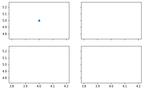
ax.plot(4, 5, 'o') # plot the point (4,5)
[<matplotlib.lines.Line2D at 0x13f1a5d60>]
The latter way is recommended, especially when you have multiple subplots, it can return ax as an array, and it is convenient for you to handle each ax using ax[i]. You can decide how many rows and columns of subplots in your figure at the beginning using plt.subplots(nrows, ncolumns). You can also control sharing of properties among x (sharex) or y (sharey) axes, specify the size of each subplot (figsize).
fig, ax = plt.subplots(2, 2, sharex=True, sharey=True, figsize=(8, 5))
ax[0,0].plot(4,5, 'o')
[<matplotlib.lines.Line2D at 0x13f299d30>]
Although sometimes the code of artist layer plotting is more verbose than that of scripting layer plotting, it is easier to read. This is a very important practice to let you produce quality code and increase the readability of your code. So taken together, we may use plt.xxx( ) to quickly get a plot for exploratory data analysis, however, ax.xxx( ) is a go-to style when your code is part of a serious project and need to be shared with others.
1.1.4. Workflow example of visualization#
This section shows a workflow of basic visualization example. This is just to give you a intuitive impression and it doesn’t mean that you should follow this workflow 100 percent. Feel free to explore more about operations to design your own visualization.
First, prepare data for visualization
import numpy as np
import pandas as pd
# np.array
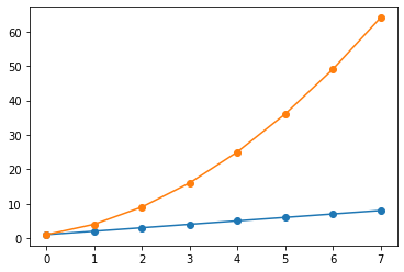
linear_data = np.linspace(1, 8, 8)
exponential_data = linear_data**2
print(linear_data)
print(exponential_data)
# dataframe
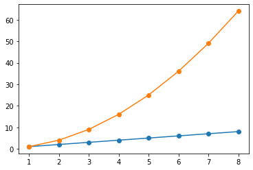
df = pd.DataFrame({'linear': linear_data,
'exponent': exponential_data},
index=range(1, 9))
print(df)
[1. 2. 3. 4. 5. 6. 7. 8.]
[ 1.  4.  9. 16. 25. 36. 49. 64.]
   linear  exponent
1     1.0       1.0
2     2.0       4.0
3     3.0       9.0
4     4.0      16.0
5     5.0      25.0
6     6.0      36.0
7     7.0      49.0
8     8.0      64.0
Then, choose suitable type of graph (line, bar, histogram, heatmap, etc) and plot the data
# plot the data with np.array type
# without given x-axes valuse, x values will be started at 0 by default
# plt.subplots() == plt.subplots(1,1,1) == plt.subplots(111)
fig, ax = plt.subplots()
# plot the linear data and the exponential data
ax.plot(linear_data, '-o', exponential_data, '-o')
[<matplotlib.lines.Line2D at 0x14ee08b20>,
 <matplotlib.lines.Line2D at 0x14ee08a90>]
# plot the data with dataframe type
fig, ax = plt.subplots()
ax.plot(df, '-o')
# same as:
# plot the data by giving multiple series
# ax.plot(df['linear'], '-o', df['exponent'], '-o')
# plot the data by pointing out x and y value
# ax.plot(df.index, df.values, '-o')
[<matplotlib.lines.Line2D at 0x14fd6e430>,
 <matplotlib.lines.Line2D at 0x14fd6e520>]
This example shows some features about pyplot.plot:
(1) if we only give y-axes values to our plot call, no x-axes values, then the plot function is smart enough to figure out what we want is to use the index of the series as the x-axes value. So you can directly give a dataframe or series to plot function. Also, you can point out what is the y-axes values and what is the x-axes values to make it clear.
(2) when more than one series of data are given to the plot function, it can identify these multiple series of data and color the data differently.
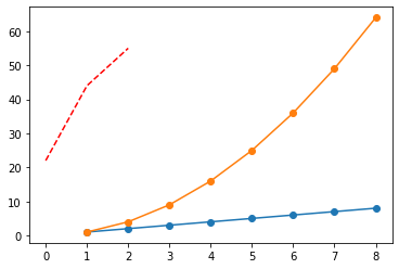
Add more data
Sometimes we will get extra data and would like to add it to the figure to represent more information. We can direcetly plot extra graphs using ax.xxx(). At the same time, we can specify some properties of the graphs, such as color, linestyle, alpha, label, etc. Because there are so many properties that we can not remember all of them, checking out the official documnet is a good way when you want to design something specific.
fig, ax = plt.subplots()
ax.plot(df, '-o')

# plot another series with a dashed red line
ax.plot([22,44,55], '--r')
[<matplotlib.lines.Line2D at 0x176f51190>]
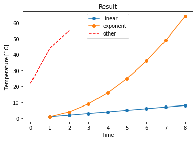
Add elements to provide necessary information
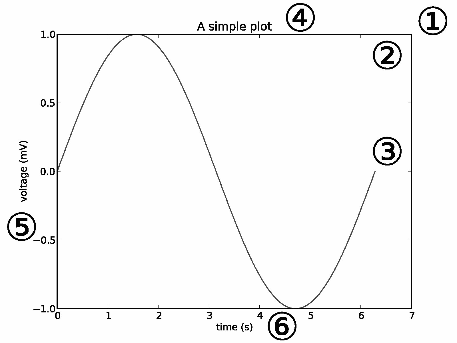
It is neceaary to provide some information, such as xlable, ylable, title, legend, etc. Without these, readers will feel confused about your figure. Also, you can specify the properties of these elements to control their location, size, etc. You can add mathematical expressions in any text element in Markdown format.
fig, ax = plt.subplots()
ax.plot(df, '-o')
# plot another series with a dashed red line
ax.plot([22,44,55], '--r')

# add xlabel, ylable, and title
ax.set_xlabel('Time')
ax.set_ylabel('Temperature [$^\circ C$]')
ax.set_title('Result')
# add a legend with legend entries (because we didn't have labels when we plotted the data series)
# specify location of the legend by loc property
ax.legend(list(df.columns)+['other'], loc='upper center')
<matplotlib.legend.Legend at 0x2980a5c70>
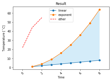
Embellish your plot
Visual embellishment can benefit comprehension and memorability of charts (relative research here). For example, we can highlight the difference between linear and exponent curves using fill_between(). Sometimes, we also need to modify the existed elements in the figure. For example, we can change y-axes limits using plt.ylim( ) or ax.set_ylim( ), specify the properties of tick labels for aixs using ax.tick_params(), and so on. But remember that just do it when you need it.
fig, ax = plt.subplots()
ax.plot(df, '-o')
# plot another series with a dashed red line
ax.plot([22,44,55], '--r')
# add xlabel, ylable, and title
ax.set_xlabel('Time')
ax.set_ylabel('Temperature [$^\circ C$]')
ax.set_title('Result')
# add a legend with legend entries (because we didn't have labels when we plotted the data series)
ax.legend(list(df.columns)+['other'], loc='upper center')

# fill the area between the linear data and exponential data
ax.fill_between(df.index,
                linear_data, exponential_data,
                facecolor='#56B4E9',  # you can specify the color you like
                alpha=0.25)
# modify elements
ax.set_xlim(-1,9)
ax.tick_params(axis='x', labelrotation=45)
💡 Last but not least, it is not possible to enumerate all the properties, functions and operations in this tutorial. So please explore more in Google and see yourself as a desginer to visualize all the information you want. Enjoy the journey of creaction and designing!
1.1.5. Plots in statistics#
In this section, some commonly used plots in statistics will be introduced, including histograms, density plots, pie charts, bar charts, box plots, and scatter plots.
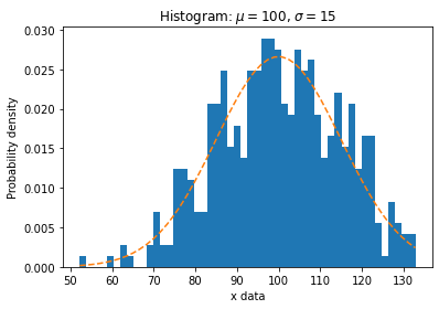
1.1.5.1. Histograms#
A histogram represents the distribution of a continuous variable. The hist() function automatically generates histograms and returns the bin counts or probabilities.
Let’s randomly generate some data with mean \(\mu\) and standard deviation \(\sigma\) to see the distribution.
np.random.seed(20)   # Fixing random state for reproducibility

# example data
mu = 100  # mean of distribution
sigma = 15  # standard deviation of distribution
x = mu + sigma * np.random.randn(450)  # Return 450 samples from the standard normal distribution

num_bins = 50  # number of bins for the histogram

# plot the histogram of the data
fig, ax = plt.subplots()
n, bins, _ = ax.hist(x, num_bins, density=True)
# n: array, the values of the histogram bins.
# bins: array, the edges of the bins.
# density: If True, draw and return a probability density: each bin will display the bin's raw count divided by the total number of counts and the bin width

# add a 'best fit' line
y = ((1 / (np.sqrt(2 * np.pi) * sigma)) *
     np.exp(-0.5 * (1 / sigma * (bins - mu))**2))  # the analytical formula of the normal distribution
ax.plot(bins, y, '--')
ax.set_xlabel('x data')
ax.set_ylabel('Probability density')
ax.set_title(r'Histogram: $\mu=100$, $\sigma=15$')
Text(0.5, 1.0, 'Histogram: $\\mu=100$, $\\sigma=15$')
1.1.5.2. Density plots#
Density plots give us an idea of the shape of the distribution of observations. This is like the histogram, except a function is used to fit the distribution of observations and a nice, smooth line is used to summarize this distribution.
There are many ways to generate the density plot. Here we plot it directly by estimating the density function from the given data using the gaussian_kde() method from the scipy.stats module. Another way is to set kind='density' in pandas.DataFrame.plot() method, which will be discussed later in the section of Time series data visualization.
from scipy.stats import kde

# kernel-density estimate using Gaussian kernels
density = kde.gaussian_kde(x)
y = density(bins)

# plot the histogram of the data
fig, ax = plt.subplots()
n, bins, _ = ax.hist(x, num_bins, density=True)
ax.plot(bins, y, linewidth=3)
ax.set_xlabel('x data')
ax.set_ylabel('Probability density')
ax.set_title(r'Histogram: $\mu=100$, $\sigma=15$')
Text(0.5, 1.0, 'Histogram: $\\mu=100$, $\\sigma=15$')

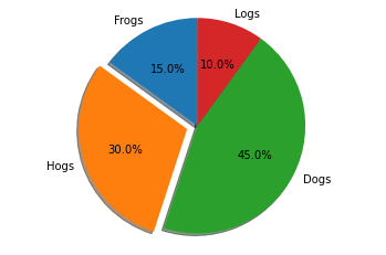
1.1.5.3. Pie charts#
Pie charts illustrate the proportions of categorical variables. The pie() function automatically generates pie charts.
# Pie chart, where the slices will be ordered and plotted counter-clockwise:
labels = 'Frogs', 'Hogs', 'Dogs', 'Logs'
sizes = [15, 30, 45, 10]
explode = (0, 0.1, 0, 0)  # only "explode" the 2nd slice (i.e. 'Hogs')

fig1, ax1 = plt.subplots()
ax1.pie(sizes, explode=explode, labels=labels, autopct='%1.1f%%',
        shadow=True, startangle=90)
ax1.axis('equal')  # Equal aspect ratio ensures that pie is drawn as a circle.

plt.show()
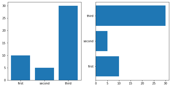
1.1.5.4. Bar charts#
Bar charts are useful for visualizing counts, or summary statistics with error bars. Use bar() or barh() function for bar charts or horizontal bar charts.
labels = ['first', 'second', 'third']
values = [10, 5, 30]

fig, axes = plt.subplots(figsize=(10, 5), ncols=2)
axes[0].bar(labels, values)
axes[1].barh(labels, values)
<BarContainer object of 3 artists>
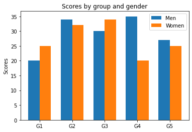
You may also plot grouped bar charts with labels by customizing labels and x-axis tick labels.
labels = ['G1', 'G2', 'G3', 'G4', 'G5']
men_means = [20, 34, 30, 35, 27]
women_means = [25, 32, 34, 20, 25]

x = np.arange(len(labels))  # the label locations
width = 0.35  # the width of the bars

fig, ax = plt.subplots()
rects1 = ax.bar(x - width/2, men_means, width, label='Men')
rects2 = ax.bar(x + width/2, women_means, width, label='Women')

# Add some text for labels, title and custom x-axis tick labels, etc.
ax.set_ylabel('Scores')
ax.set_title('Scores by group and gender')
ax.set_xticks(x)
ax.set_xticklabels(labels)
ax.legend()

# Adds the value labels to bars. This is only available for Matplotlib 3.4 or above
# ax.bar_label(rects1, padding=3)
# ax.bar_label(rects2, padding=3)
<matplotlib.legend.Legend at 0x2ab78a5e0>
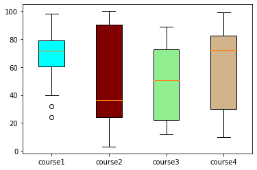
1.1.5.5. Box plots#
Box plots provide insight into distribution properties of the data. The boxplot() function makes a box and whisker plot for each column of the input. The box extends from the lower to upper quartile values of the data, with a line at the median. The whiskers extend from the box to show the range of the data.
value1 = [82, 76, 24, 40, 67, 62, 75, 78, 71, 32, 98, 89, 78, 67, 72, 82, 87, 66, 56, 52]
value2 = [62, 5, 91, 25, 36, 32, 96, 95, 3, 90, 95, 32, 27, 55, 100, 15, 71, 11, 37, 21]
value3 = [23, 89, 12, 78, 72, 89, 25, 69, 68, 86, 19, 49, 15, 16, 16, 75, 65, 31, 25, 52]
value4 = [59, 73, 70, 16, 81, 61, 88, 98, 10, 87, 29, 72, 16, 23, 72, 88, 78, 99, 75, 30]

box_plot_data = [value1, value2, value3, value4]

# plot
fig, ax = plt.subplots()
box = ax.boxplot(box_plot_data, vert=True, patch_artist=True, labels=['course1', 'course2', 'course3', 'course4'])
# vert=True, draw vertical boxes
# patch_artist=True, produce boxes with Patch artists

colors = ['cyan', 'maroon', 'lightgreen', 'tan']
for patch, color in zip(box['boxes'], colors):
    patch.set_facecolor(color)
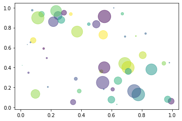
1.1.5.6. Scatter plots#
Scatter plots show the extent of correlation between two variables on horizontal and vertical axes. To make a scatter plot, use scatter() function. The color, size, and style of the markers could be changed according to your need.
np.random.seed(19)  # Fixing random state for reproducibility

N = 50
x = np.random.rand(N)
y = np.random.rand(N)
colors = np.random.rand(N)
area = (30 * np.random.rand(N))**2  # 0 to 15 point radii

fig, ax = plt.subplots()
ax.scatter(x, y, s=area, c=colors, alpha=0.5)
# s, size
# c, color
# alpha, transparency
<matplotlib.collections.PathCollection at 0x2ab8bb850>
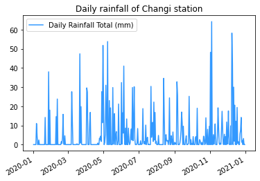
1.1.6. Time series data visualization#
There are multiple ways to visualize the time series data. Here, we will take the dataset of ‘Daily rainfall of Changi station’ as an example to demonstrate some simple and useful methods.
First, read the data from csv file and check the contents. Remember to set parse_dates=True to convert the index column to datetime. You may also parse specific column(s) by e.g. parse_dates=[1, 2, 3].
import pandas as pd

# read the dataset from csv
fn = '../../assets/data/Changi_daily_rainfall.csv'
# './python-climate-visuals-master/assets/data/Changi_daily_rainfall.csv'
df = pd.read_csv(fn, index_col=0, header=0, parse_dates=True)

# only use the data in 2020
df_2020 = df.loc['2020',:]
# show the head of the dataframe
df_2020.head()

# df_2020['Daily Rainfall Total (mm)']  # You may uncomment this to see what they are
# df_2020.index
| Daily Rainfall Total (mm) | |
|---|---|
| Date | |
| 2020-01-01 | 0.0 |
| 2020-01-02 | 0.0 |
| 2020-01-03 | 0.0 |
| 2020-01-04 | 0.0 |
| 2020-01-05 | 0.0 |
1.1.6.1. Line plots#
The Line plot is one of the most basic visualizations in time series analysis. You may use plot_date() function, which is similar to plot() where the input is x and y pair.
fig, ax = plt.subplots()
ax.plot_date(df_2020.index, df_2020['Daily Rainfall Total (mm)'], linestyle ='solid', fmt='none', color='#3399ff')
ax.set_title('Daily rainfall of Changi station')
ax.legend(df_2020)
fig.autofmt_xdate()  # This automatically rotate the x labels
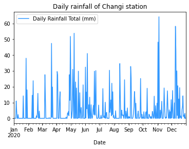
Alternatively as introduced in Pandas Tutorial (Advanced), this could also be achieved by:
df_2020.plot(title='Daily rainfall of Changi station', color='#3399ff')
<AxesSubplot:title={'center':'Daily rainfall of Changi station'}, xlabel='Date'>
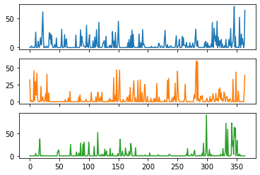
You may show comparisons of time series in different years by the method of dataframe.plot() mentioned above (and groupby() function introduced in Pandas Tutorial (Advanced)). However, the following codes need to assure that the data length of each subplot is the same, i.e., it can only handle 365 days in a year.
df_2017_2019 = df.loc[(df.index >= '2017-01-01')
                     & (df.index < '2020-01-01')]
df_2017_2019['Daily Rainfall Total (mm)'].head()
Date
2017-01-01    0.8
2017-01-02    0.0
2017-01-03    0.6
2017-01-04    2.8
2017-01-05    0.6
Name: Daily Rainfall Total (mm), dtype: float64
groups = df_2017_2019['Daily Rainfall Total (mm)'].groupby(pd.Grouper(freq='A'))
groups.head()
years = pd.DataFrame()
for name, group in groups:
    years[name.year] = group.values
years.plot(subplots=True, legend=False)
array([<AxesSubplot:>, <AxesSubplot:>, <AxesSubplot:>], dtype=object)
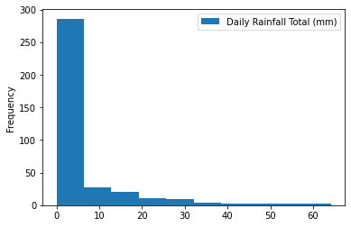
1.1.6.2. Histograms and density plots#
Generating histograms and density plots for time series data is similar to previous illustration of plots in statistics.
df_2020.hist() # This function calls matplotlib.pyplot.hist()
array([[<AxesSubplot:title={'center':'Daily Rainfall Total (mm)'}>]],
      dtype=object)
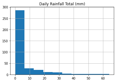
Alternatively, dataframe.plot() could handle this by setting another argument kind='hist'.
df_2020.plot(kind='hist')
<AxesSubplot:ylabel='Frequency'>
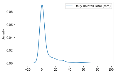
The density plot can be created by simply changing an argument.
df_2020.plot(kind='kde')
# df_2020.plot(kind='density'), same as kind='kde'
<AxesSubplot:ylabel='Density'>
1.1.6.3. Box plots#
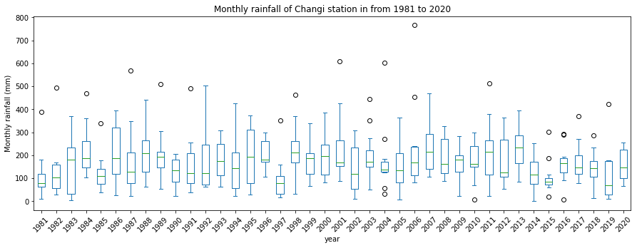
Here, we follow the codes in Pandas Tutorial (Advanced) to calculate the monthly cumulative rainfall and generate a box plot for monthly rainfall in different years. The resample() function in pandas is utilized. You may refer to Pandas Tutorial (Advanced) for more details.
dfmonth = df.resample('M').sum()
dfmonth = pd.concat([i[1].reset_index(drop=True) for i in dfmonth.loc['1981':'2020',:].groupby(pd.Grouper(freq='Y'))], axis=1)
dfmonth.columns = range(1981, 2021)
dfmonth.index = range(1, 13)
dfmonth.columns.name = 'year'
dfmonth.index.name = 'month'
You can call matplotlib.pyplot.hist() to generate box plots.
ax = dfmonth.boxplot(figsize=(15,5))
ax.set_xticklabels(dfmonth.columns,rotation=45)
ax.set_xlabel('year')
Text(0.5, 0, 'year')
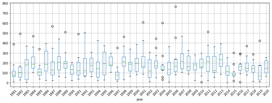
Alternatively, dataframe.plot() could handle this by setting another argument kind='box'.
ax = dfmonth.plot(title='Monthly rainfall of Changi station in from 1981 to 2020', xlabel='year',
             ylabel='Monthly rainfall (mm)', kind='box', figsize=(15,5))
ax.set_xticklabels(dfmonth.columns,rotation=45)
ax.set_xlabel('year')
Text(0.5, 0, 'year')
1.1.6.4. Lag plots#
Previous observations in a time series are called lags, with the observation at the previous time step called lag1, the observation at two time steps ago lag2, and so on.
A useful type of plot to explore the relationship between each observation and a lag of that observation is called the lag plot, which is a special type of scatter plot. It could be realized by the lag_plot() function in pandas.plotting.
from pandas.plotting import lag_plot

lag_plot(df_2020['Daily Rainfall Total (mm)'], 2)
<AxesSubplot:xlabel='y(t)', ylabel='y(t + 2)'>
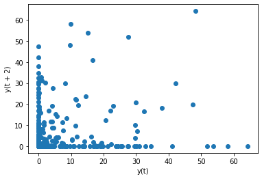
The above result shows that there is no strong correlation between observations and their lag2 values, as the distribution is relatively random.
1.1.6.5. Autocorrelation plots#
An autocorrelation plot is designed to show whether the elements of a time series are positively correlated, negatively correlated, or independent of each other. This could be realized by autocorrelation_plot() function.
The horizontal axis of an autocorrelation plot shows the size of the lag between the elements of the time series. For example, the autocorrelation with lag 2 is the correlation between the time series elements and the corresponding elements that were observed two time periods earlier.
Each spike that rises above or falls below the dashed lines is considered to be statistically significant. This means the spike has a value that is significantly different from zero. If a spike is significantly different from zero, that is evidence of autocorrelation.
from pandas.plotting import autocorrelation_plot

autocorrelation_plot(df_2020['Daily Rainfall Total (mm)'])
<AxesSubplot:xlabel='Lag', ylabel='Autocorrelation'>
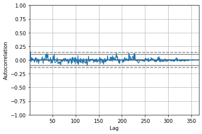
In the above example, all values fall within the two dashed lines, showing the evidence against autocorrelation.
1.1.7. 2D plotting methods#
In this section, we will illustrate how to produce 2D plots, including images, contour plots, quiver plots, and stream plots.
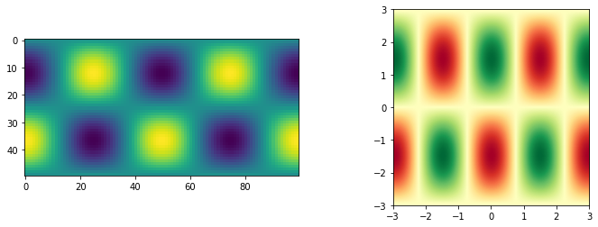
1.1.7.1. Images#
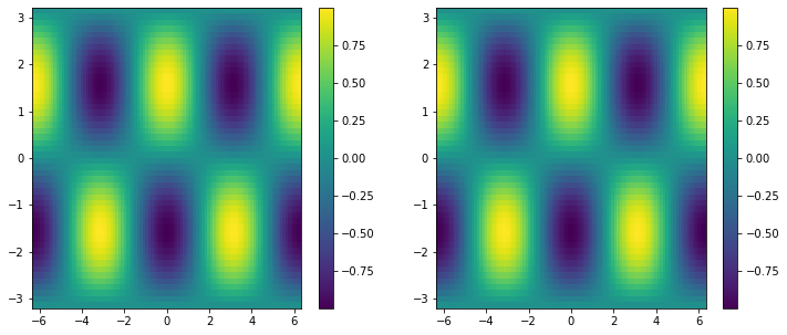
1.1.7.1.1. Imshow#
The most common way to plot images in Matplotlib is with imshow(). You may modify multiple arguments to generate the desirable plot.
# generate the data for plotting
x1d = np.linspace(-2*np.pi, 2*np.pi, 100)
y1d = np.linspace(-np.pi, np.pi, 50)
xx, yy = np.meshgrid(x1d, y1d)
f = np.cos(xx) * np.sin(yy)
print(f.shape)
(50, 100)
fig, ax = plt.subplots(figsize=(12,4), ncols=2)
a = ax[0].imshow(f)
ax[1].imshow(f, interpolation='bilinear', cmap=plt.cm.RdYlGn,
               origin='lower', extent=[-3, 3, -3, 3],
               vmax=abs(f).max(), vmin=-abs(f).max())
<matplotlib.image.AxesImage at 0x2acbe4a90>
1.1.7.1.2. Pcolor/pcolormesh#
pcolor or pcolormesh is another method to create images.
fig, ax = plt.subplots(ncols=2, figsize=(12, 5))

# the following two inputs have the same effects
pc0 = ax[0].pcolormesh(x1d, y1d, f, shading='auto')
pc1 = ax[1].pcolormesh(xx, yy, f, shading='auto')

# generate color bar
fig.colorbar(pc0, ax=ax[0])
fig.colorbar(pc1, ax=ax[1])
<matplotlib.colorbar.Colorbar at 0x2acd7cdc0>
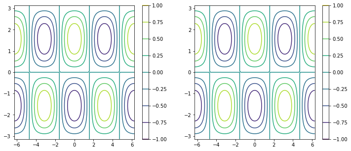
1.1.7.2. Contour plots#
The following example basically plots the same thing as above. The only difference is that contours are substituted for colored pixels.
fig, ax = plt.subplots(figsize=(12, 5), ncols=2)

# same thing!
pc0 = ax[0].contour(x1d, y1d, f)
pc1 = ax[1].contour(xx, yy, f)

# generate color bar
fig.colorbar(pc0, ax=ax[0])
fig.colorbar(pc1, ax=ax[1])
<matplotlib.colorbar.Colorbar at 0x2acf397f0>
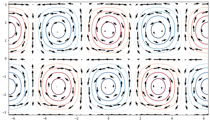
1.1.7.3. Quiver plots#
Quiver plots are for 2D fields of arrows. It is often used for vectors, such as wind velocity.
u = -np.cos(xx) * np.cos(yy)
v = -np.sin(xx) * np.sin(yy)

clevels = np.arange(-1, 1, 0.2) + 0.1  #  draw contour lines at the specified levels

fig, ax = plt.subplots(figsize=(12, 7))
ax.contour(xx, yy, f, clevels, cmap='RdBu_r', zorder=0)
ax.quiver(xx[::4, ::4], yy[::4, ::4],
           u[::4, ::4], v[::4, ::4], zorder=1)
<matplotlib.quiver.Quiver at 0x2acf775e0>
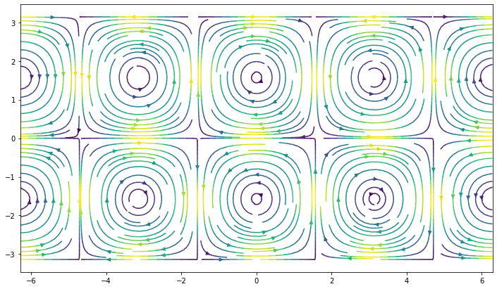
1.1.7.4. Stream plots#
streamplot() draws streamlines of a vector flow.
fig, ax = plt.subplots(figsize=(12, 7))
ax.streamplot(xx, yy, u, v, density=2, color=(u**2 + v**2))
<matplotlib.streamplot.StreamplotSet at 0x2ae3a7250>
After this tutorial, you should have had a basic idea of which functions to choose for a specific type of plot. For more details on the functions, please refer to the documentations listed below in the References.